---
title: Employee KPI Dashboard with Oracle OTBI & Oracle HCM Cloud | ennVee
description: See how ennVee built a real-time Employee KPI Dashboard using Oracle OTBI and Oracle HCM Cloud — replacing manual spreadsheets with drill-down workforce analytics for HR and leadership teams.
image: https://blog.ennvee.com/hubfs/Blog%20Image%20SM/KPI_Dashboard_HCM.webp
---
- Services & Technologies
- Services
- [Data & AI](https://ennvee.com/data-and-ai/)
- [Digital Transformation](https://ennvee.com/digital-transformation/)
- [Data Intelligence](https://ennvee.com/data-intelligence/)
- [Technologies](https://ennvee.com/technologies/)
- [Oracle Fusion Cloud](https://ennvee.com/oracle-fusion/)
- [Oracle E-Business Suite](https://ennvee.com/oracle-ebs/)
- [Oracle JD Edwards](https://ennvee.com/oracle-jde/)
- [Oracle NetSuite](https://ennvee.com/oracle-netsuite/)
- [Cloud Infrastructure (IaaS)](https://ennvee.com/oracle-cloud-infrastructure/)
- [Microsoft Dynamics](https://ennvee.com/microsoft-dynamics-365/)
- [Salesforce](https://ennvee.com/salesforce-cloud-services/)
- [Application Development & Integration](https://ennvee.com/application-integration-services/)
- [SAP](https://ennvee.com/sap/)
- [Tools & Accelerators](https://ennvee.com/accelerators/)
- [ennABLE](https://ennvee.com/accelerators/oracle-ebs-r12-2-upgrade-automation/)
- [ennAccess](https://info.ennvee.com/jde-user-access-record-tool)
- [TrendZ](https://ennvee.com/accelerators/oracle-proactive-system-monitoring/)
- [EDI](https://ennvee.com/accelerators/oracle-edi-automation-tool/)
- Products & Solutions
- [ennSCM](https://ennvee.com/products/ennscm/)
- [ennData 360](https://ennvee.com/products/enndata360/)
- [AI ILMS](https://ennvee.com/products/ai-ilms/)
- [AI in Finance Operations](https://ennvee.com/products/ai-in-finance-operations/)
- [Expense Application](https://ennvee.com/products/expense-application/)
- [Chatbot](https://ennvee.com/products/chatbot/)
- [Field Sales Pro](https://ennvee.com/products/field-sales-pro/)
- [AI - Powered Ticketing Tool](https://ennvee.com/products/ai-powered-ticketing-tool/)
- [AI - Powered PO to SO](https://ennvee.com/products/ai-powered-po-so/)
- [AI - Resume Grader](https://ennvee.com/products/ai-resume-grader/)
- Insights
- [Blogs](https://blog.ennvee.com/blog)
- [Datasheets](https://ennvee.com/data-sheets/)
- [Case Studies](https://ennvee.com/case-studies/)
- [Whitepapers](https://ennvee.com/white-papers/)
- Company
- [About](https://ennvee.com/about-us/)
- [Careers](https://ennvee.com/careers/)
- [News and Events](https://ennvee.com/news-and-events/)
- [Contact Us](https://ennvee.com/contact-us/)
×
Search
- Services & Technologies
- Services
- [Data & AI](https://ennvee.com/data-and-ai/)
- [Digital Transformation](https://ennvee.com/digital-transformation/)
- [Data Intelligence](https://ennvee.com/data-intelligence/)
- [Technologies](https://ennvee.com/technologies/)
- [Oracle Fusion Cloud](https://ennvee.com/oracle-fusion/)
- [Oracle E-Business Suite](https://ennvee.com/oracle-ebs/)
- [Oracle JD Edwards](https://ennvee.com/oracle-jde/)
- [Oracle NetSuite](https://ennvee.com/oracle-netsuite/)
- [Cloud Infrastructure (IaaS)](https://ennvee.com/oracle-cloud-infrastructure/)
- [Microsoft Dynamics](https://ennvee.com/microsoft-dynamics-365/)
- [Salesforce](https://ennvee.com/salesforce-cloud-services/)
- [Application Development & Integration](https://ennvee.com/application-integration-services/)
- [SAP](https://ennvee.com/sap/)
- [Tools & Accelerators](https://ennvee.com/accelerators/)
- [ennABLE](https://ennvee.com/accelerators/oracle-ebs-r12-2-upgrade-automation/)
- [ennAccess](https://info.ennvee.com/jde-user-access-record-tool)
- [TrendZ](https://ennvee.com/accelerators/oracle-proactive-system-monitoring/)
- [EDI](https://ennvee.com/accelerators/oracle-edi-automation-tool/)
- Products & Solutions
- [ennSCM](https://ennvee.com/products/ennscm/)
- [ennData 360](https://ennvee.com/products/enndata360/)
- [AI ILMS](https://ennvee.com/products/ai-ilms/)
- [AI in Finance Operations](https://ennvee.com/products/ai-in-finance-operations/)
- [Expense Application](https://ennvee.com/products/expense-application/)
- [Chatbot](https://ennvee.com/products/chatbot/)
- [Field Sales Pro](https://ennvee.com/products/field-sales-pro/)
- [AI - Powered Ticketing Tool](https://ennvee.com/products/ai-powered-ticketing-tool/)
- [AI - Powered PO to SO](https://ennvee.com/products/ai-powered-po-so/)
- [AI - Resume Grader](https://ennvee.com/products/ai-resume-grader/)
- Insights
- [Blogs](https://blog.ennvee.com/blog)
- [Datasheets](https://ennvee.com/data-sheets/)
- [Case Studies](https://ennvee.com/case-studies/)
- [Whitepapers](https://ennvee.com/white-papers/)
- Company
- [About](https://ennvee.com/about-us/)
- [Careers](https://ennvee.com/careers/)
- [News and Events](https://ennvee.com/news-and-events/)
- [Contact Us](https://ennvee.com/contact-us/)
# From Spreadsheets to Strategy: How ennVee Built an Employee KPI Dashboard with Oracle OTBI and Oracle HCM Cloud
[← All posts](https://blog.ennvee.com/blog)
16 MIN READ
Published: 10 July 2026
Every HR leader knows the feeling: a leadership meeting is an hour away, and someone still needs to pull the latest attrition numbers, validate the data, and turn it into a chart. Multiply that by headcount reports, turnover trends, tenure analysis, and location-wise breakdowns, and HR teams can end up spending more time assembling data than actually using it.
That was the reality for one organization before ennVee stepped in.
Using Oracle Transactional Business Intelligence (OTBI) integrated with Oracle HCM Cloud, ennVee built a centralized Employee KPI Dashboard that replaced fragmented spreadsheets and manually prepared reports with real-time, interactive workforce reporting — giving HR teams and business leaders faster access to the insights they need.
## The Problem: Great Data, Poor Access
Before the dashboard, workforce reporting depended heavily on Excel files, manually prepared reports, and disconnected sources of information. Metrics as fundamental as headcount, turnover, attrition, tenure distribution, and department-level movement had to be pulled together by hand for every reporting cycle — extracted, validated, reconciled, charted, and circulated.
The cost wasn't just time. It also affected the speed and quality of decision-making.
Leaders didn't always have current workforce data in front of them, and when someone asked, "What's driving this number?" getting an answer usually meant another round of manual analysis and data gathering.
What the organization needed was a KPI dashboard that could deliver:
Real-time visibility into workforce data
Interactive dashboards for HR and leadership
Dynamic filtering across multiple business dimensions
Standardized and consistent workforce KPI reporting
One-click drill-down to employee-level detail
Role-based access control to protect sensitive workforce data
Reduced dependency on manually prepared spreadsheets
The goal wasn't simply to digitize existing reports. It was to build a scalable workforce analytics framework that HR teams and business leaders could trust and act on.
## The Solution: One Dashboard, Five Views, Full Drill-Down
ennVee's solution was an Employee KPI Dashboard built on Oracle OTBI and integrated directly with Oracle HCM Cloud.
Users can now analyze workforce data by Department, Business Unit, Country, Location, Gender, Tenure, Salary Type, and Legal Employer — all within one interactive environment instead of moving between multiple static reports and spreadsheets.
The dashboard is organized into five purpose-built areas:
- Active Employee KPIs
- Turnover
- Attrition
- Attrition Rolling
- 12 Months Rolling
Each view serves a different business question — from "What does our workforce look like today?" to "Is our attrition trend improving or getting worse over time?"
Every chart, graph, and KPI tile is interactive. With one click, users can open the underlying employee-level report in a new tab, allowing them to move directly from a summary metric to the detailed data behind it.
## Active Employee KPI Dashboard
This dashboard provides the organization's current workforce snapshot.
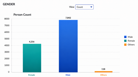
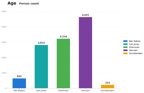
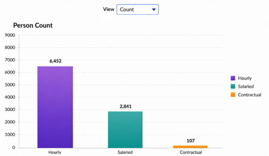
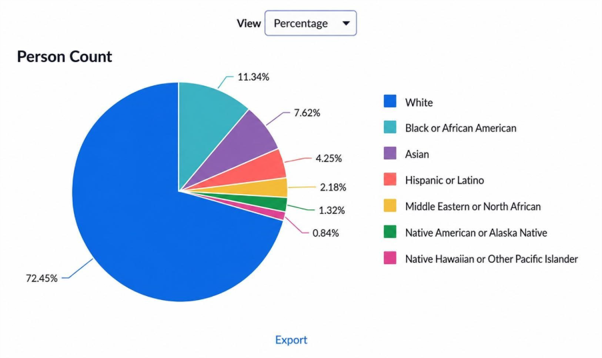
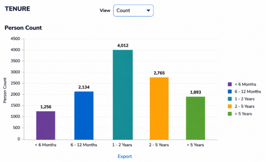
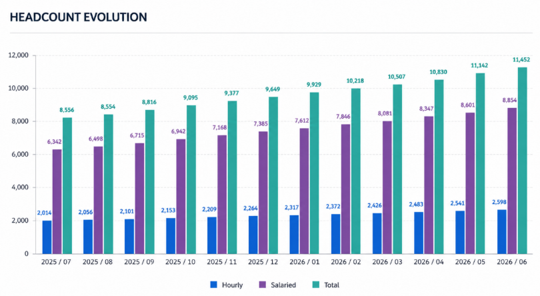
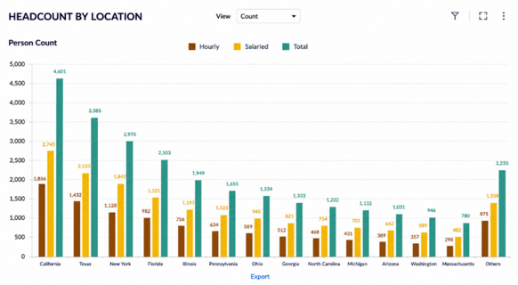
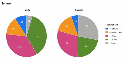
Users can view active headcount as of any selected date and analyze workforce composition by gender, age group, ethnicity, tenure, hourly versus salaried status, and location.
A 12-month headcount trend is also included, allowing leaders to understand not only where workforce levels stand today, but also how they have changed over time.
If a manager notices something unusual — such as unexpected headcount movement at a particular location — they no longer need to submit a separate request to HR for additional information. They can simply click the relevant visualization and access the underlying details.
#### Gender
#### Age
#### Person Count
#### Ethnicity
#### Tenure
#### Headcount Evolution
#### Headcount by Location
## Turnover Dashboard
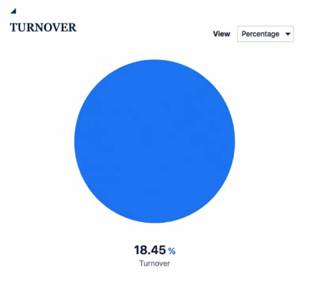
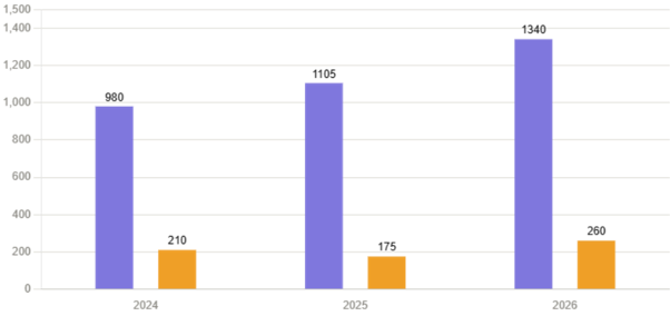
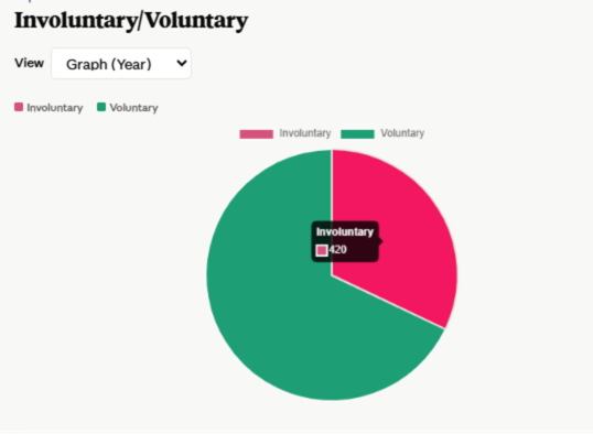
Filtered by year and month, the Turnover Dashboard tracks employee terminations by hourly versus salaried status and by termination type — voluntary versus involuntary.
The same drill-down capability provides direct access to employee-level records for further analysis.
Separating voluntary from involuntary exits gives HR and business leaders a clearer understanding of workforce movement and helps identify where potential retention concerns may be developing.
#### Terminated Employee Count by Hourly / Salaried Employees
#### Terminated Employee Count by Termination Type (Voluntary / Involuntary)
## Attrition Dashboard
This is where workforce patterns begin to surface.
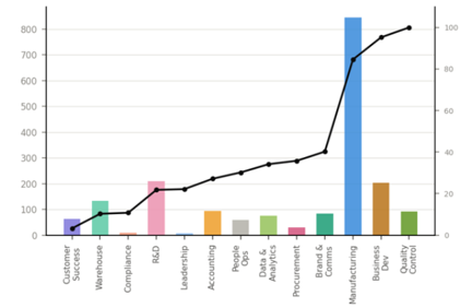
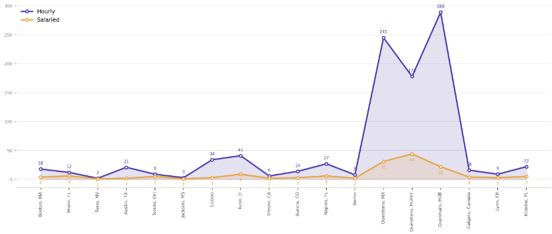
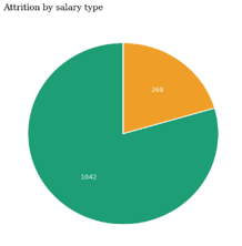
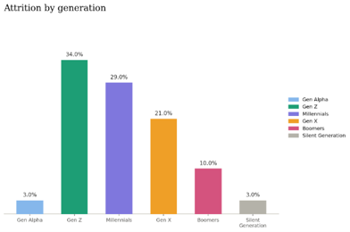
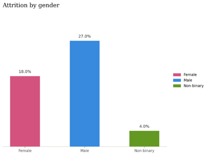
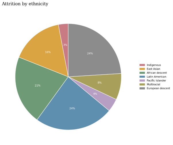
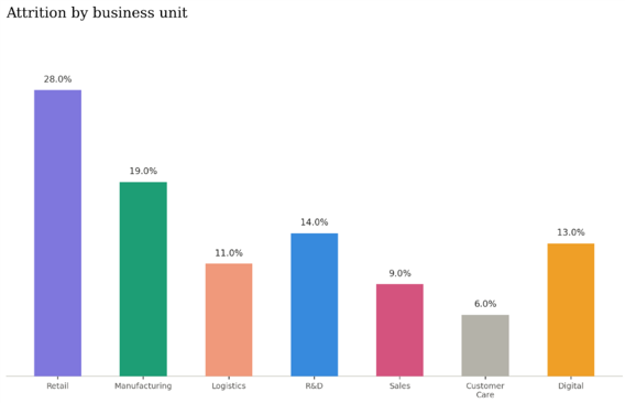
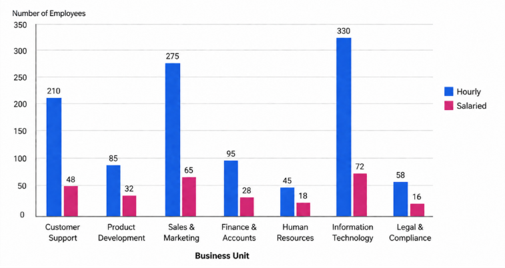
Attrition can be analyzed by Function, Tenure, Location, Salary Type, Generation, Gender, Ethnicity, Business Unit, and Business Unit combined with Salary Type.
If attrition is concentrated within a specific function, location, employee group, or business unit, the pattern becomes visible immediately.
This transforms attrition from a backward-looking metric into a starting point for deeper workforce analysis, retention planning, and management action.
## Attrition Rolling Dashboard
Single-month attrition numbers can fluctuate and may not always provide an accurate picture of long-term workforce trends.
The Attrition Rolling Dashboard addresses this challenge by providing a rolling 12-month view of attrition across key workforce dimensions, including Function, Tenure, Location, Salary Type, Generation, Gender, Ethnicity, and Business Unit.
It is designed for leadership teams that want to understand whether attrition is trending upward, declining, or remaining stable over time — rather than focusing only on what happened during the previous month.
#### Attrition by Function
#### Attrition by Tenure
#### Attrition by Location
#### Attrition by Salary Type
#### Attrition by Generation
#### Attrition by Gender
#### Attrition by Ethnicity
#### Attrition by Business Unit
#### Attrition by Business Unit and Salary Type
## 12 Months Rolling Dashboard
The 12 Months Rolling Dashboard provides the most comprehensive long-term view of workforce movement.
It includes hourly attrition percentage, salaried attrition percentage, overall attrition percentage, and cumulative termination trends across a rolling 12-month period.
This dashboard gives executives and HR leaders an at-a-glance view of long-term workforce stability and organizational health.
## Built-In Drill-Down, Not Bolted-On
One of the dashboard's most valuable capabilities is its integrated drill-down reporting.
From any chart, graph, or KPI tile, a single click opens a detailed employee-level report that can be filtered, analyzed, and downloaded for further review.
This closes the gap between "Here's the number" and "Here's what's driving it" — without requiring another round of ad hoc data requests.
Instead of waiting for HR or IT teams to prepare additional reports, authorized users can move directly from workforce KPIs to the underlying details they need for analysis and decision-making.
## Designed Around How People Actually Use Data
Navigation remains within OTBI throughout the entire experience, eliminating the need to switch between tools during analysis.
Common filters — including As of Date, Business Unit, Department, Country, Location, Legal Employer, Gender, Tenure, and Salary Type — are applied consistently across dashboard sections.
As a result, once users become familiar with one dashboard view, the remaining views feel intuitive and consistent.
Because the dashboard contains sensitive workforce information, access is role-based by design:
- **HR Analysts —** full dashboard and report access
- **HR Managers —** access scoped to their departments and areas of responsibility
- **Business Leaders —** read-only access to relevant workforce KPIs
- **Executives —** organization-wide workforce visibility
Authentication, data-level security, and controlled export permissions further strengthen the access model, ensuring that the right users see the right information — and nothing more.
## What It Took to Build
The technical implementation started with requirements gathering — understanding leadership's reporting needs, identifying the workforce KPIs that mattered most, defining reporting logic, and determining who needed access to specific information.
From there, the ennVee team worked through:
- OTBI analysis and report development
- Dashboard and visualization design
- KPI and reporting logic standardization
- Filter configuration
- Drill-down report development
- Role-based access configuration
- Performance optimization
- Data validation and reconciliation
- Multi-stage testing and user validation
Two challenges stood out during the implementation.
#### Performance at Scale
Large workforce data volumes initially affected report load times. The ennVee team optimized OTBI analyses, filters, queries, and dashboard components to improve performance and provide the responsive user experience expected from a real-time analytics environment.
#### Consistency Across Views
With five dashboards using overlapping workforce data, standardized reporting logic was essential.
The team established consistent KPI definitions and reporting logic to ensure that metrics such as headcount, turnover, and attrition meant the same thing regardless of where users encountered them.
This consistency was critical to building user confidence and trust in the dashboard.
## The Payoff
The shift from spreadsheets to an interactive, OTBI-powered dashboard changed more than reporting speed — it changed how HR teams and business leaders use workforce information.
Operationally:
- Manual reporting effort was significantly reduced
- Reports became faster and more consistent
- Data reconciliation errors were minimized
- Employee-level details became a click away instead of a separate reporting request
- Dependency on manually prepared spreadsheets was substantially reduced
For leadership:
- Faster, more informed decision-making
- Stronger workforce planning based on current data
- Clearer visibility into attrition and turnover trends
- Earlier identification of potential workforce risks
- Improved alignment between HR and business leadership
- Greater confidence in workforce KPIs and reporting
Workforce information that previously lived across multiple spreadsheets and disconnected reports is now available through one centralized analytics environment.
HR teams spend less time gathering and reconciling numbers and more time understanding what those numbers mean.
And that is the real transformation: moving from static reporting to proactive workforce intelligence.
## Frequently Asked Questions (FAQ)
What is an Employee KPI Dashboard, and why do enterprise HR leaders need one?
An Employee KPI Dashboard is a centralized, interactive reporting tool that consolidates core workforce metrics — headcount, turnover, attrition, and tenure — into real-time visualizations. For enterprise HR leaders, it replaces manual spreadsheet reporting with reliable, current data that supports faster workforce decisions, stronger board-level reporting, and more confident strategic planning.
How does Oracle OTBI integrate with Oracle HCM Cloud for workforce reporting?
Oracle Transactional Business Intelligence (OTBI) connects directly to live transactional data within Oracle HCM Cloud, so HR teams can build interactive dashboards without exporting data to spreadsheets. This native integration enables real-time, drill-down workforce analytics that stay accurate as HR records change, eliminating the lag and reconciliation errors common with manual reporting.
What KPIs should enterprise HR executives track in a workforce analytics dashboard?
Core KPIs include active headcount, turnover by termination type, overall and rolling 12-month attrition, and tenure distribution across dimensions such as department, location, business unit, and salary type. Tracking these consistently across the organization helps executives spot retention risks and workforce trends early, before they affect business performance.
How does role-based access control protect sensitive workforce data in HR dashboards?
Role-based access ensures HR analysts, HR managers, business leaders, and executives each see only the workforce data relevant to their responsibilities — from full dashboard access for HR analysts to organization-wide visibility for executives. Combined with authentication and controlled export permissions, this protects sensitive employee data while still giving leadership the visibility they need.
How long does it take to implement an Oracle OTBI-based KPI dashboard for enterprise HR?
Timelines vary with scope, but implementation typically covers requirements gathering, OTBI report development, dashboard and filter design, KPI standardization, role-based access configuration, and multi-stage testing. Enterprise organizations should also plan for performance tuning at scale, since large workforce data volumes can affect report load times if not optimized early.
## Ready to Turn Workforce Data Into a Strategic Asset?
If your HR team is still manually assembling headcount, turnover, attrition, and workforce data, there is a better way.
ennVee's Oracle OTBI and Oracle HCM Cloud expertise can help organizations transform fragmented workforce data into interactive, secure, and actionable analytics designed around how HR teams and business leaders actually make decisions.
Move beyond spreadsheets. Give your HR and leadership teams the workforce intelligence they need to make faster, more informed decisions.
[Talk to ennVee](https://ennvee.com/contact-us/) about building a workforce analytics dashboard for your organization.
### Tags
[Cloud](https://blog.ennvee.com/blog/tag/cloud) [Oracle](https://blog.ennvee.com/blog/tag/oracle) [oracle hcm](https://blog.ennvee.com/blog/tag/oracle-hcm)
### Recent Posts
- [Oracle Fusion AI Recruiting: AI-Powered Candidate Ratings](https://blog.ennvee.com/blog/oracle-fusion-ai-recruiting-candidate-ratings)
- [Moving Towards Cloud](https://blog.ennvee.com/blog/moving-towards-cloud)
- [5 Reasons why Companies are Moving to the Cloud](https://blog.ennvee.com/blog/why-companies-are-moving-to-the-cloud)
- [Crash Course: IaaS, CaaS, PaaS, FaaS](https://blog.ennvee.com/blog/iaas-caas-paas-faas-crash-course)
- [Migrating an Application to Azure Cloud](https://blog.ennvee.com/blog/azure-cloud-migration)
## You Might Also Like...
[BLOG Oracle ECC: Modernizing Your E-Business Suite with Interactive Dashboards](https://blog.ennvee.com/blog/oracle-ecc-ebs-modernization-dashboards)
[BLOG Migrating from Oracle EBS to Fusion Cloud](https://blog.ennvee.com/blog/migrating-from-oracle-ebs-to-fusion-cloud)
[BLOG Oracle Fusion Order Management: How Reservation and Pick Controls Improve Fulfillment for Enterprise Trading Businesses](https://blog.ennvee.com/blog/oracle-fusion-order-management-reservation-pick-controls)
- [SERVICES](https://ennvee.com/services/)
- [Oracle Fusion Cloud](https://ennvee.com/oracle-fusion/)
- [Oracle E-Business Suite](https://ennvee.com/oracle-ebs/)
- [Oracle JD Edwards](https://ennvee.com/oracle-jde/)
- [Oracle NetSuite](https://ennvee.com/netsuite/)
- [Cloud Infrastructure (laaS)](https://ennvee.com/infrastructure-iaas/)
- [Robotic Process Automation (RPA)](https://ennvee.com/robotic-process-automation/)
- [INNOVATIONS](https://ennvee.com/accelerators/)
- [Accelerators](https://ennvee.com/accelerators/#ProprietaryAccelerators)
- [Products](https://ennvee.com/accelerators/#Products)
- [INSIGHTS](https://ennvee.com/resources/)
- [Blog](https://blog.ennvee.com/blog)
- [Data Sheets](https://ennvee.com/data-sheets/)
- [Case Studies](https://ennvee.com/case-studies/)
- [White Papers](https://ennvee.com/white-papers/)
- CONTACT INFORMATION
- US: +1-630-364-1911
- India: +91-93848 42661
- mail: corp@ennvee.net
-
[© ennVee. All Rights Reserved.](https://ennvee.com/legal-notice/)
- [privacy policy](https://ennvee.com/privacy-policy/)
- [site map](https://ennvee.com/page-sitemap.xml)

- Services
- [Oracle Fusion Applications](https://ennvee.com/oracle-saas-applications/)
- [NetSuite](https://ennvee.com/netsuite/)
- [Microsoft Dynamics](https://ennvee.com/microsoft-dynamics-365/)
- [Salesforce](https://ennvee.com/salesforce/)
- [Infrastructure (IaaS)](https://ennvee.com/infrastructure-iaas/)
- [Application Managed Services](https://ennvee.com/application-managed-services/)
- [Robotic Process Automation (RPA)](https://ennvee.com/robotic-process-automation/)
- [Application Integration Services](https://ennvee.com/application-integration-services/)
- [Accelerators](https://ennvee.com/accelerators/)
- [Oracle EBS Upgrade Automation](https://ennvee.com/accelerators/oracle-ebs-r12-2-upgrade-automation/)
- [Oracle Proactive System Monitoring](https://ennvee.com/accelerators/oracle-proactive-system-monitoring/)
- [Oracle Discoverer Migration Tool](https://ennvee.com/accelerators/oracle-discoverer-migration-tool/)
- [Oracle EDI Automation Tool](https://ennvee.com/accelerators/oracle-edi-automation-tool/)
- Resources
- [Blog](https://blog.ennvee.com/blog)
- [Data Sheets](https://ennvee.com/data-sheets/)
- [Case Studies](https://ennvee.com/case-studies/)
- [Webinars](https://ennvee.com/webinars/)
- [White Papers](https://ennvee.com/white-papers/)
- [Careers](https://ennvee.com/careers/)
[](https://www.linkedin.com/company/ennvee/) [](https://www.facebook.com/ennveetechnogroup/) [](https://twitter.com/ennVeeTech) [](https://www.instagram.com/ennvee_india/)
[© ennVee. All Rights Reserved.](https://ennvee.com/legal-notice/)
[Privacy Policy](https://ennvee.com/privacy-policy/) [Site Map](https://ennvee.com/page-sitemap.xml)
